THU PHAM - ARTIST

THU PHAM - ARTIST

by Ghouls Just Wanna Have Fun Studio
In Hell, demons gathered around a monstrous Plinko machine, its jagged teeth glowing in the infernal light. Instead of a typical Plinko ball, they used a grotesque meat cube, made from various mashed humans. As the cube tumbled through the machine's perilous path, it bounced unpredictably, each clatter filled with the screams of the damned. The demons watched eagerly, hoping for a chance to escape their eternal torment. The cube's final position determined whether they remained in Hell or faced a brief, tormenting respite.
DETAILS

7 people
16 weeks
Unity
Mobile
Software used: Procreate, Photoshop, Stubstance Painter
Roles: Texture and 2D Artist
Responsibilities:
-
Textured 7 models
-
Produced concept art
-
Created UI, game Icon, logo design
-
Marketing materials
Trailer
In Game Screenshots
Working on the Drop Dead project gave me a valuable opportunity to explore mobile game development in Unity and dive into a new, unique art style. The cartoonish, silly, yet gory aesthetic was unlike anything I’d worked on before, making it an exciting learning experience. While I had prior experience with 2D cartoon styles, adding humor with a touch of gore was new and helped expand my artistic versatility. Additionally, the project required combining 2D and 3D elements, another first for me, which broadened my skills and deepened my understanding of multi-dimensional game design.


UI ASSETS
Software used: Procreate, Photoshop
The goal of the UI art assets was to create a cartoonish, slightly silly, yet gory aesthetic. The color palette was intentionally chosen to evoke bloody, meaty tones, enhancing the overall theme. Over time, the UI design evolved based on both thematic feedback and how the assets looked in-game. This iterative process not only helped refine the visuals, but also gave me valuable insights into balancing creativity with functionality. Throughout the development, I learned the importance of adaptability—adjusting designs to ensure they fit seamlessly within the game while maintaining their intended visual impact. This project significantly expanded my understanding of UI design, and how subtle changes can make a big difference in user experience.


TEXTURE WORKS
Software used: Stubstance Painter
My texturing approach emphasizes rich detail, leveraging vivid reds and dynamic, layered effects to create depth and atmosphere. Working from blank models, I apply intricate textures—realistic skin tones, blood splashes, pores, and subtle surface imperfections—to enhance visual storytelling and reinforce the game's theme. This process has strengthened my ability to craft immersive, cohesive assets that elevate the overall player experience.
Additionally, I explore creative techniques, such as designing expressive elements to enhance character and environmental storytelling. Reflecting on past work, I recognize the importance of aligning style with the game's artistic direction. Some textures initially leaned too realistic for a stylized, cartoonish aesthetic, highlighting my ongoing focus on refining techniques to match the intended visual identity.


Other Works
Main menu
Software: Procreate, Photoshop
Size:
DPI: 100
Size: 1080 x 2560
Duration: 4hrs
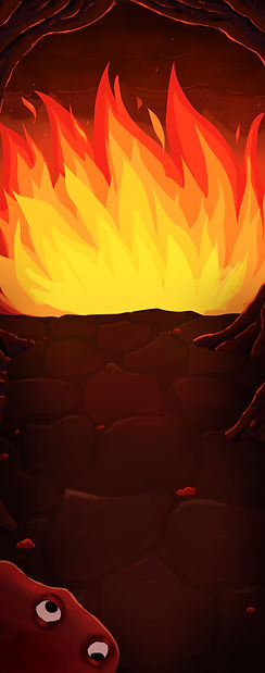
I collaborated closely with the team to design a main menu that aligned with the game's Hell-themed narrative. My vision was to create a pathway leading into Hell, setting the game's tone. One challenge was the overly prominent stone tile background, which made the menu feel cluttered. To fix this, I reduced its opacity, improving readability.
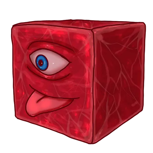
Team feedback also led to key refinements. The initial yellow tones felt too "cozy," so I shifted to a red palette for a darker, more infernal look. I also added a meat cube to enhance the gruesome aesthetic. This process reinforced the importance of balancing design vision with usability, ensuring both thematic impact and a seamless player experience.
Meat Cube Concept art
Software: Procreate, Photoshop
Size:
DPI: 132
Size: 2048 x 2048
Duration: 1hr 25m

Reflection
Drop Dead was a valuable learning experience that helped me better understand the importance of communication, clarity, and visual alignment within a team. While the project faced some challenges—such as occasional miscommunication and a lack of clearly defined design goals—I used these moments to improve how I collaborate across disciplines. For instance, when an unexpected yellow overlay appeared on my UI implementation in-game, I worked closely with the team to troubleshoot and discuss potential solutions, which sharpened my problem-solving and communication skills even when a fix wasn’t immediately found.Artistically, this project pushed me to reevaluate my approach to texturing. Early on, my work leaned too realistic for the game’s playful, cartoony style. This mismatch motivated me to study stylization more deeply and move away from overreliance on premade materials. I began experimenting with hand-painted touches and more intentional use of texture maps, which significantly improved the cohesion of my later work. Overall, Drop Dead helped me grow not just as an artist, but as a more thoughtful and adaptive team member—someone who learns from creative setbacks and is committed to continuous improvement.


